As matplotlib becomes so powerful, Python can pretty much replace R for a lot of data analysis and visualization. In fact, it is easier to do plot with Matplotlib than R.
Here are some examples from simple to complicated. The examples below are also in ipynb file in GitHub
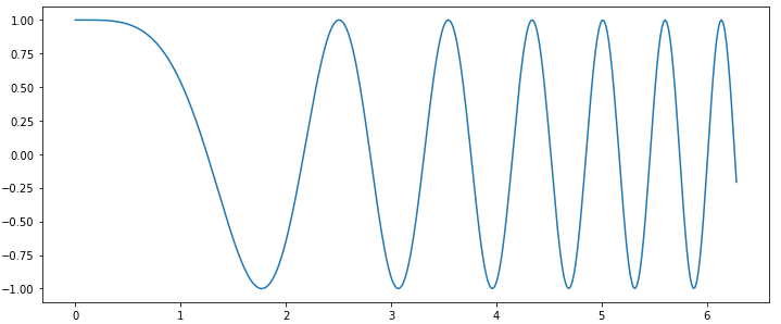
A simple plot
import matplotlib
%matplotlib inline
matplotlib.rcParams['figure.figsize'] = (12.0, 5.0)
# use plt.figure(figsize=(8, 6)) for py code

import numpy as np
import matplotlib.pyplot as plt
x = np.linspace(0, 2 * np.pi, 400)
y = np.cos(x**2)
plt.plot(x, y)
plt.show()
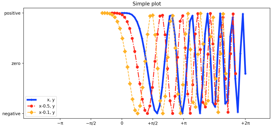
A simple plot with multiple lines and plot config (xlim/ylim, legend, ticks)
import numpy as np
import matplotlib.pyplot as plt

x = np.linspace(0, 2 * np.pi, 50)
y = np.cos(x**2)

# use subplot for simple figure
f, ax = plt.subplots(1, 1)

# add plots (one is enough) using different parameters
ax.plot(    x, y, color="blue", linewidth=4, linestyle="-",
       marker='+', label="      x, y")
ax.plot(x-0.5, y, color="red",  linewidth=2, linestyle="-.",
       marker='o', label="x-0.5, y")
ax.plot(x-1.0, y, color="orange",  linewidth=1.5, linestyle="--",
       marker='D', label="x-0.1, y")

# add a legend
ax.legend(loc='lower left') # use upper/low right/left

# set up title
ax.set_title('Simple plot')

# define x and y limit
ax.set_xlim(x.min() - 5, x.max() * 1.2)
ax.set_ylim(y.min() - 0.1, y.max() + 0.1)

# define tick labels
ax.set_xticks([-np.pi, -np.pi/2, 0, np.pi/2, np.pi, np.pi*2])
ax.set_xticklabels([r'−π', r'−π/2', r'0', r'+π/2', r'+π', r'+2π'])
ax.set_yticks([-1, 0, +1])
ax.set_yticklabels(['negative', 'zero', 'positive'])

plt.show()   # f.show() should also work in py file
A list of commonly used color/marker/line code
| Code code | |
| r | Red |
| b | Blue |
| g | Green |
| c | Cyan |
| m | Magenta |
| y | Yellow |
| k | Black |
| w | White |
| Marker Code | |
| + | Plus Sign |
| . | Dot |
| o | Circle |
| * | Star |
| p | Pentagon |
| s | Square |
| x | X Character |
| D | Diamond |
| h | Hexagon |
| ^ | Triangle |
| Linestyle Code | |
| - | Solid Line |
| – | Dashed Line |
| : | Dotted Line |
| -. | Dash-Dotted Line |
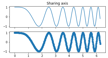
A simple plot sharing x and y axis
import numpy as np
import matplotlib.pyplot as plt
matplotlib.rcParams['figure.figsize'] = (6.0, 3.0)

x = np.linspace(0, 2 * np.pi, 400)
y = np.cos(x**2)
f, ax = plt.subplots(2, 1, sharex=True)
# or share y:
# f, ax = plt.subplots(1, 2, sharey=True)
ax[0].plot(x, y)
ax[0].set_title('Sharing axis')
ax[1].scatter(x, y)
plt.show()
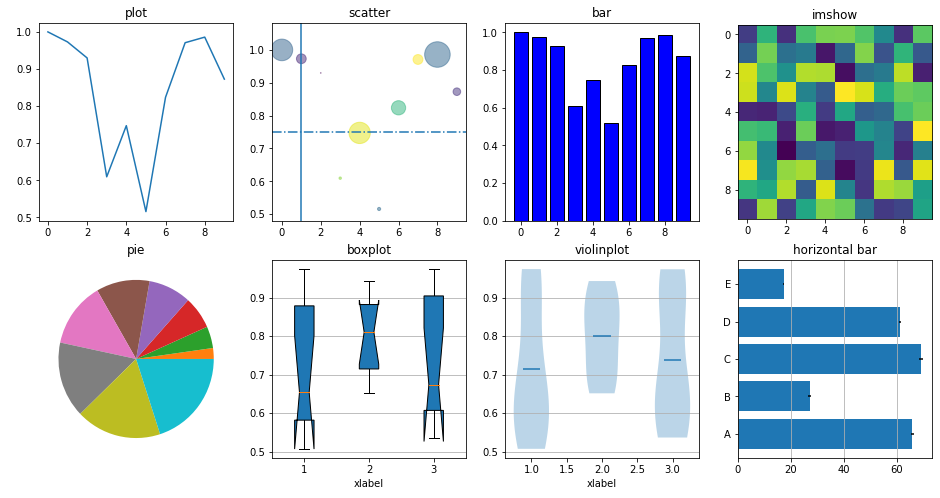
Subplot to illustrate difference kinds of plots in Matplotlib
matplotlib plots: scatter, lines, boxplot, violin plot, images, pie, vertical and horizontal bar
import matplotlib
import numpy as np
import matplotlib.pyplot as plt
# adjsut the fig size
matplotlib.rcParams['figure.figsize'] = (16.0, 8.0)

x = np.arange(10)
y = np.random.uniform(0.5, 1.0, 10)
area = np.pi * (15 * np.random.rand(10))**2 # 0 to 15 point radii
colors = np.random.rand(10)
z = np.random.uniform(0.5, 1.0, 100).reshape(10, 10)

f, ax = plt.subplots(2, 4)
ax[0, 0].plot(x, y)
ax[0, 0].set_title('plot')

ax[0, 1].scatter(x, y, s=area, c=colors, alpha=0.5)
ax[0, 1].set_title('scatter')
# add vertical and horizontal lines
ax[0, 1].axvline(x=1)
ax[0, 1].axhline(y=0.75, linestyle="-.")

ax[0, 2].bar(x, y, facecolor="blue", edgecolor="black")
ax[0, 2].set_title('bar')

ax[0, 3].imshow(z)
ax[0, 3].set_title('imshow')

ax[1, 0].pie(x)
ax[1, 0].set_title('pie')

ax[1, 1].boxplot(z[:,2:5], vert=True, notch=True, patch_artist=True)
ax[1, 1].set_title('boxplot')
ax[1, 1].yaxis.grid(True)
ax[1, 1].set_xlabel('xlabel')

ax[1, 2].violinplot(z[:,2:5], showmeans=True, showmedians=False, showextrema=False)
ax[1, 2].set_title('violinplot')
ax[1, 2].yaxis.grid(True)
ax[1, 2].set_xlabel('xlabel')

category = ('A', 'B', 'C', 'D', 'E')
y_pos = np.arange(len(category))
barx = 100*np.random.rand(len(category))
error = np.random.rand(len(category))
ax[1, 3].barh(y_pos, barx, xerr=error)
ax[1, 3].set_title('horizontal bar')
ax[1, 3].xaxis.grid(True)
ax[1, 3].set_yticks(y_pos)
ax[1, 3].set_yticklabels(category)

plt.show()
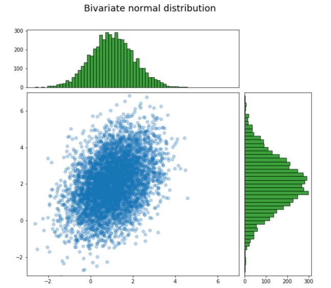
Use subplot2grid to merge plot grids and create complicated layout
The code below will draw scatter plot in the middle, and draw the data distribution of X and Y on the top and right side accordingly. It use an empty plot on top to put text, which allow us to put the title for the whole figure.
import matplotlib
import numpy as np
import matplotlib.pyplot as plt

# adjsut the fig size
matplotlib.rcParams['figure.figsize'] = (10.0, 10.0)

xy = np.random.multivariate_normal([1, 2], [[1, 0.5],[0.5, 2]], 5000)
x = xy[:, 0]
y = xy[:, 1]

ax0 = plt.subplot2grid((9, 8), (0, 0), colspan=8, rowspan=1)
ax1 = plt.subplot2grid((9, 8), (1, 0), colspan=6, rowspan=2)
ax2 = plt.subplot2grid((9, 8), (3, 0), colspan=6, rowspan=6)
ax3 = plt.subplot2grid((9, 8), (3, 6), colspan=2, rowspan=6)
# use ax0 for text of the title
ax0.set_xlim(-1, 1)
ax0.set_ylim(-1, 1)
ax0.axis('off')
ax0.text(-0.6, 0, "Bivariate normal distribution", fontsize=18)
# ax2 in the middle as scatter plot
ax2.scatter(x, y, alpha=0.3);
ax2.set_xlim(-3, 7)
ax2.set_ylim(-3, 7)
# ax1 on the top showing the distribution of x
ax1.hist(x, 50, facecolor="g", alpha=0.75, edgecolor='black')
ax1.set_xlim(-3, 7)
ax1.get_xaxis().set_visible(False)
# ax3 on the right showing the distribution of y
ax3.hist(y, 50, facecolor="g", alpha=0.75, orientation="horizontal", edgecolor='black')
ax3.set_ylim(-3, 7)
ax3.get_yaxis().set_visible(False)

plt.show()